Client
Design
Service
2022
Date
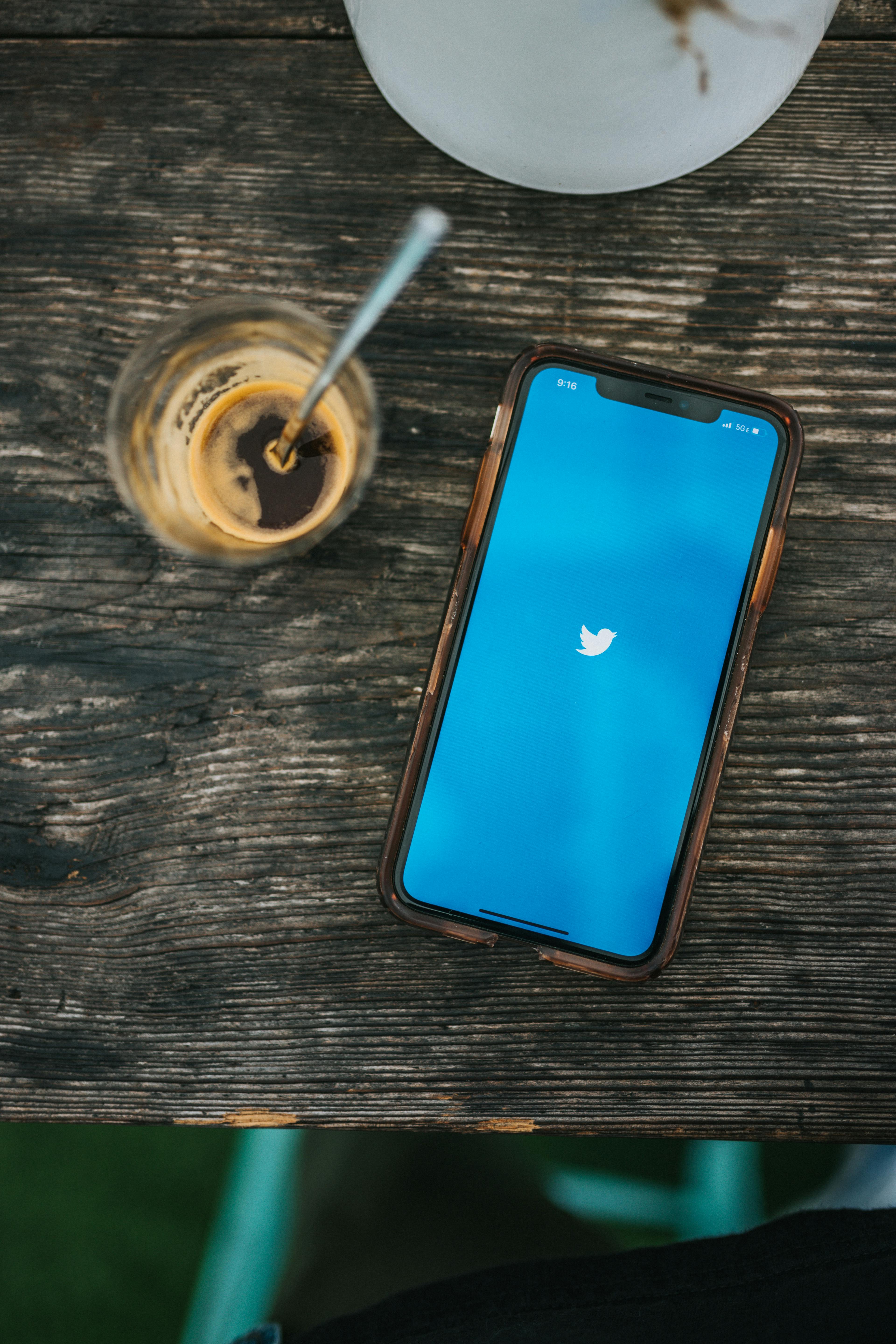
Twitter Design Case Study
Overview
In this case study, we will explore the design evolution of Twitter, the popular microblogging and social networking platform. Twitter's design has evolved to enhance user engagement, promote meaningful conversations, and establish its brand identity.
Objectives
The primary objectives of this case study are to:
- Analyze the design elements and user interface of Twitter's platform.
- Evaluate the design choices and user experience considerations behind Twitter's interface.
- Examine the impact of design changes on user engagement, growth, and brand perception.
- Understand how Twitter's design aligns with its mission of facilitating real-time conversations.
Methodology
To achieve the objectives mentioned above, we adopted the following research methods:
- Design Analysis: Conducted an in-depth analysis of Twitter's design elements, including the layout, typography, color scheme, and visual hierarchy.
- User Research: Gathered user feedback through surveys and interviews to understand their perception of Twitter's design and user experience.
- Comparative Analysis: Compared Twitter's design with other social media platforms to identify its unique attributes and competitive advantages.
- Design Principles Review: Reviewed Twitter's design principles and guidelines to gain insights into the company's approach to user-centric design.
Findings
Visual Design
- Twitter's visual design focuses on simplicity and minimalism, with a clean and uncluttered layout.
- The use of consistent branding elements, such as the logo and color palette, creates a recognizable and cohesive user experience.
User Interface
- Twitter's user interface is organized around a central feed of tweets, with clear visual indicators for replies, retweets, and likes.
- The navigation menu and search bar are easily accessible, allowing users to explore content and discover new conversations.
Color Scheme
- Twitter's blue color scheme, combined with contrasting white elements, creates a sense of trust and establishes brand recognition.
- Color is used strategically to differentiate various interaction states, such as links and buttons.
Typography
- Twitter utilizes a legible and scalable typeface for its interface, ensuring readability across different devices and screen sizes.
- Different font weights and sizes are used to differentiate between headings, tweets, and user profiles.
Real-Time Conversations
- Twitter's design choices, such as the timeline refresh and real-time updates, enable users to engage in dynamic and ongoing conversations.
- Features like hashtags and trending topics facilitate content discovery and participation in broader discussions.
Conclusion
Twitter's design evolution has contributed to its status as a popular platform for real-time conversations and information sharing. Through its clean visual design, intuitive user interface, and strategic design choices, Twitter has created an engaging and recognizable user experience. The company's commitment to facilitating meaningful conversations and delivering content in real-time has solidified its position in the social media landscape.
Through this case study, we gain insights into the design principles and user experience considerations behind Twitter's interface and the impact of design on user engagement and brand perception.