Netflix
Client
Design
Service
2023
Date
Netflix Design Case Study
Overview
In this case study, we will delve into the design of Netflix, a leading streaming platform known for its extensive library of movies, TV shows, and original content. Netflix's design plays a pivotal role in delivering an immersive and personalized user experience, enhancing content discovery, and fostering long-term engagement.
Objectives
The primary objectives of this case study are to:
- Analyze the design elements and user interface of Netflix's platform.
- Evaluate the design choices and user experience considerations behind Netflix's interface.
- Examine how Netflix's design promotes content discovery, personalization, and binge-watching behavior.
- Understand the impact of design on user engagement, customer retention, and brand loyalty.
Methodology
To achieve the objectives mentioned above, we adopted the following research methods:
- Design Analysis: Conducted an in-depth analysis of Netflix's design elements, including the layout, typography, color scheme, and visual hierarchy.
- User Research: Gathered user feedback through surveys and interviews to understand their perception of Netflix's design and user experience.
- Comparative Analysis: Compared Netflix's design with other streaming platforms to identify its unique attributes and competitive advantages.
- Design Principles Review: Reviewed Netflix's design principles and guidelines to gain insights into the company's approach to user-centric design.
Findings
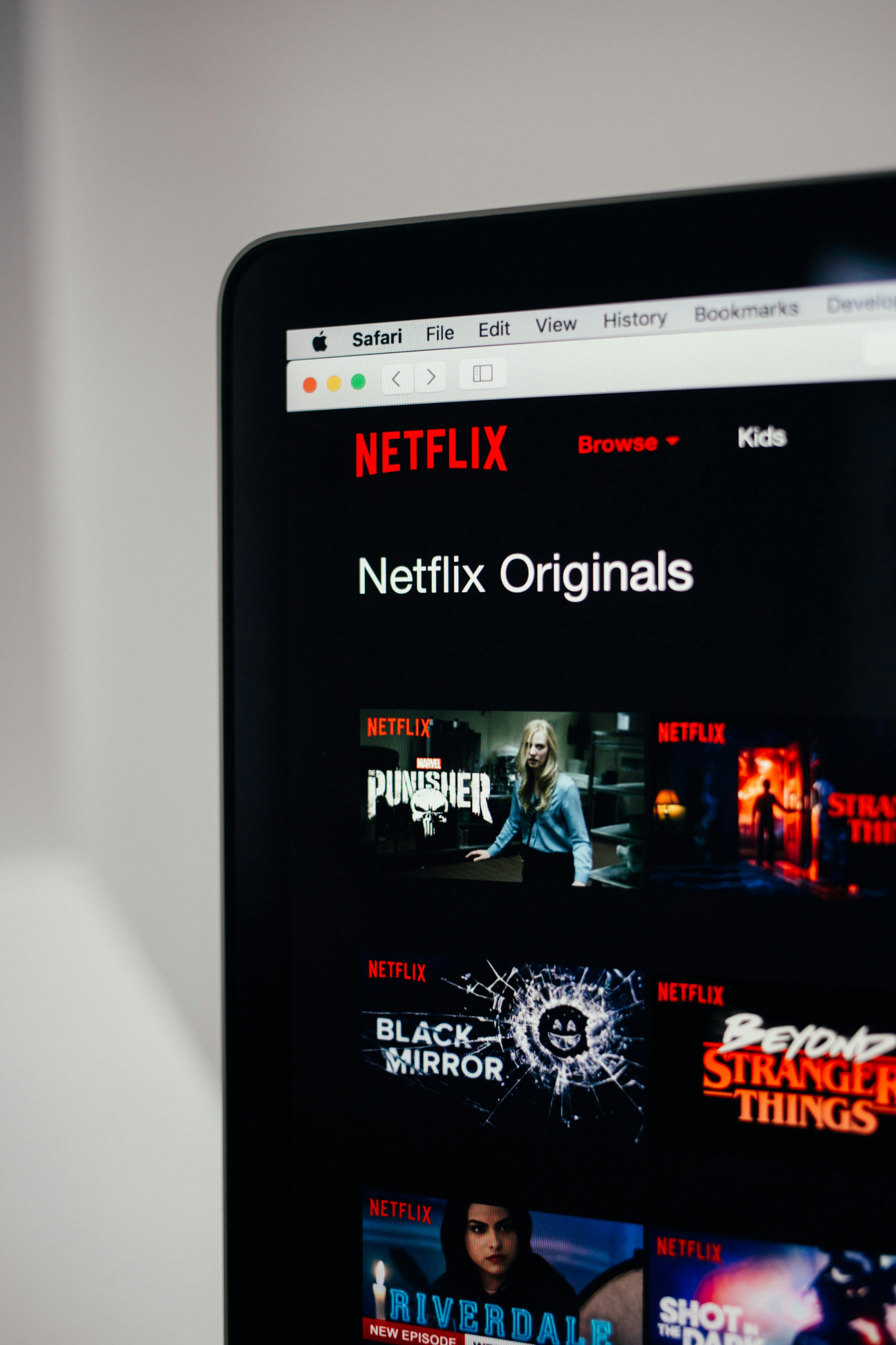
Visual Design
- Netflix's visual design showcases a clean, modern, and minimalistic aesthetic, ensuring that the content takes center stage.
- The use of high-quality imagery, consistent branding elements, and a balanced layout enhances the visual appeal and creates a cohesive user experience.
User Interface
- Netflix's user interface is designed to provide a seamless and intuitive browsing experience across various devices.
- Key elements, such as the search bar, navigation menu, and recommendation algorithms, are strategically placed to facilitate content discovery and personalization.
Color Scheme
- Netflix's color scheme employs a combination of deep red, black, and white, creating a visually striking and recognizable brand identity.
- Red is used sparingly to draw attention to important elements, such as buttons and notifications, while black and white contribute to a cinematic and immersive feel.
Typography
- Netflix utilizes a legible and contemporary typeface for its interface, ensuring readability across different screen sizes and resolutions.
- Different font weights and sizes are used to distinguish headings, titles, descriptions, and user interface elements.
Personalization and Recommendations
- Netflix's design choices, such as personalized profiles, curated recommendations, and intelligent content categorization, enable users to discover and enjoy relevant content tailored to their preferences.
- Features like "Continue Watching" and customized playlists contribute to a seamless and personalized binge-watching experience.
Conclusion
Netflix's design has played a pivotal role in its success as a leading streaming platform. Through a visually appealing interface, intuitive user experience, and strategic design choices, Netflix has created a platform that captivates users and keeps them engaged through personalized content discovery and a seamless binge-watching experience. The company's commitment to user-centric design and continuous innovation has solidified its position as a trailblazer in the streaming industry.
Through this case study, we gain insights into the design principles and user experience considerations behind Netflix's interface and the impact of design on user engagement and brand loyalty.